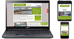
Procter Street Furniture launches responsive website
|
The new website will help architects, specifiers, contractors and end users, whether they are searching for street furniture or meeting with clients. It will also be very convenient for people on site, in addition to those in an office environment who are using a mobile device rather than a desktop or laptop computer.
Procter Street Furniture's website contains a wealth of information about high-quality standard and bespoke cycle racks, shelters and chicanes, as well as benches, seating, bollards, barriers, hoops, trolley enclosures, protection rails, bin stores, plant enclosures, and protectors for columns, pipes and lamp posts. Depending on the product design, Procter Street Furniture can work in steel, stainless steel, cast stone, timber or a combination of these materials, with all manufacture undertaken in the company's own facilities.
The website also includes information about Procter Street Furniture's design, manufacturing and installation services, plus its ability to operate in conjunction with sister divisions from the same company for projects requiring fencing and/or gates, including automatic gates. There is also a gallery on the website with dozens of photographs illustrating the wide variety of standard and bespoke street furniture that can be provided.
For more information, email info@procterstreetfurniture.co.uk or view photographs from the gallery.

